We use our own and third-party cookies to improve our services and ensure you get the best experience. By browsing the site, you are agreeing to this. You can find more information in our Privacy Policy.
A Relook at WorthWhile Future Foundation
Aligning the brand’s visual identity with its goals
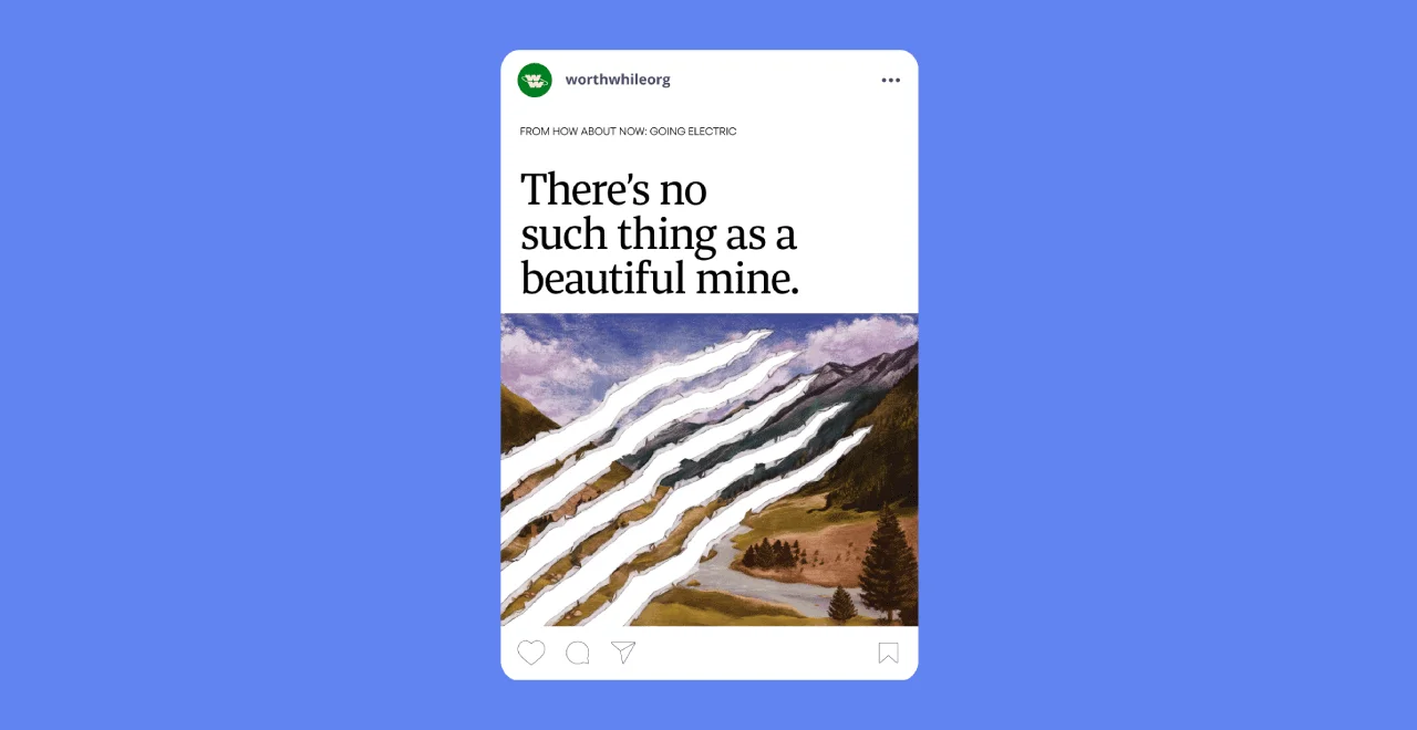
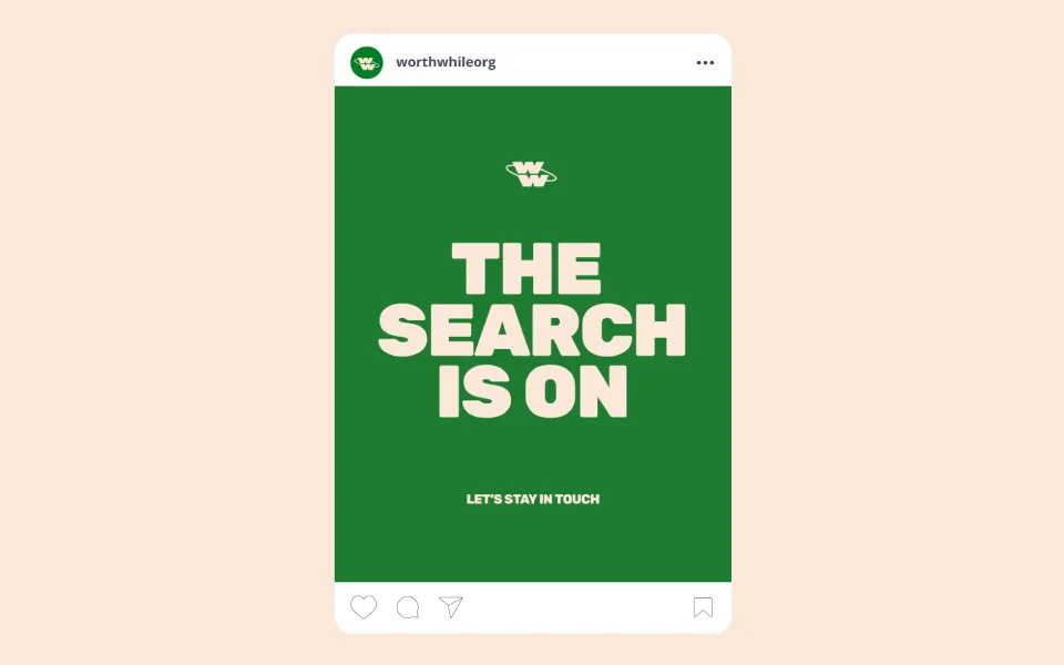
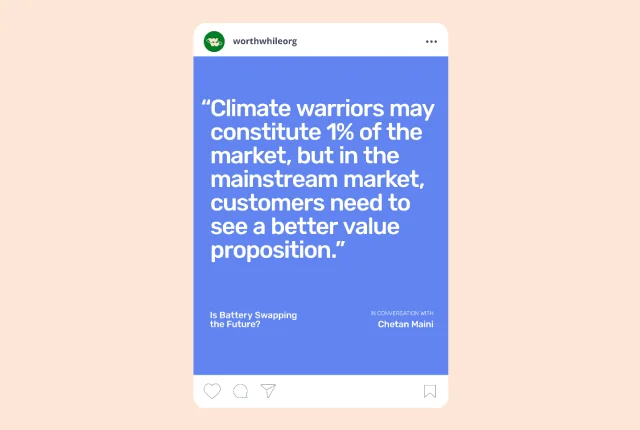
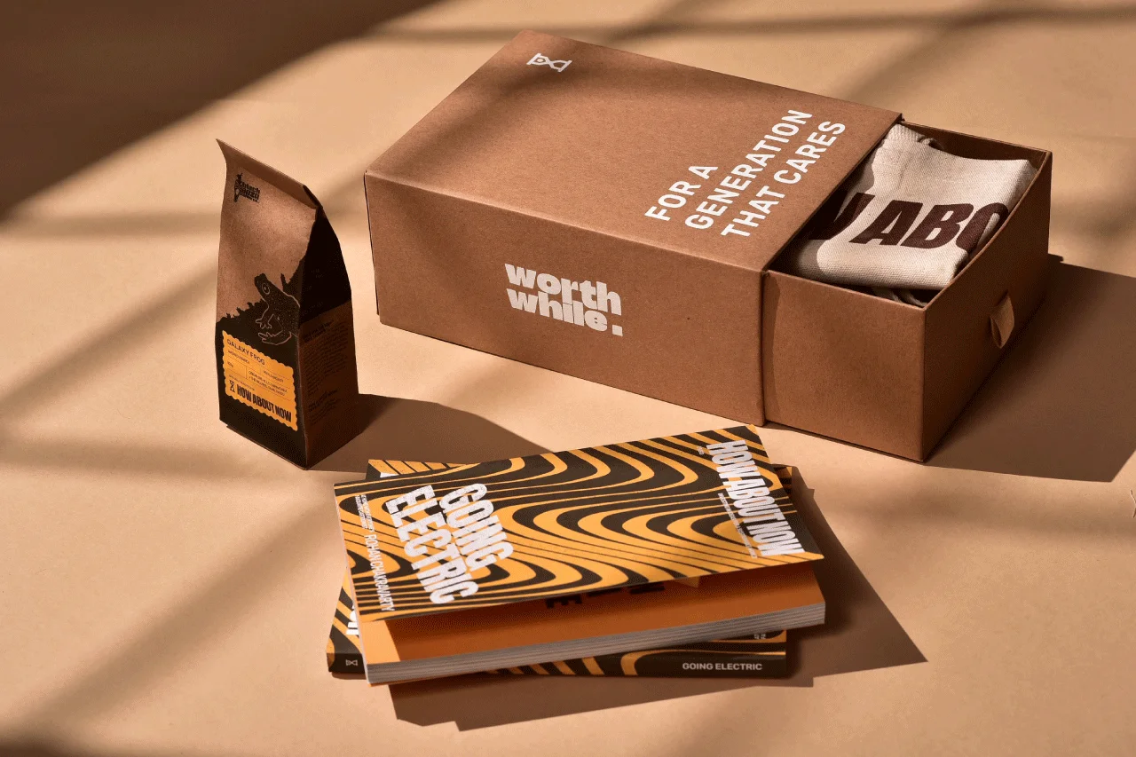
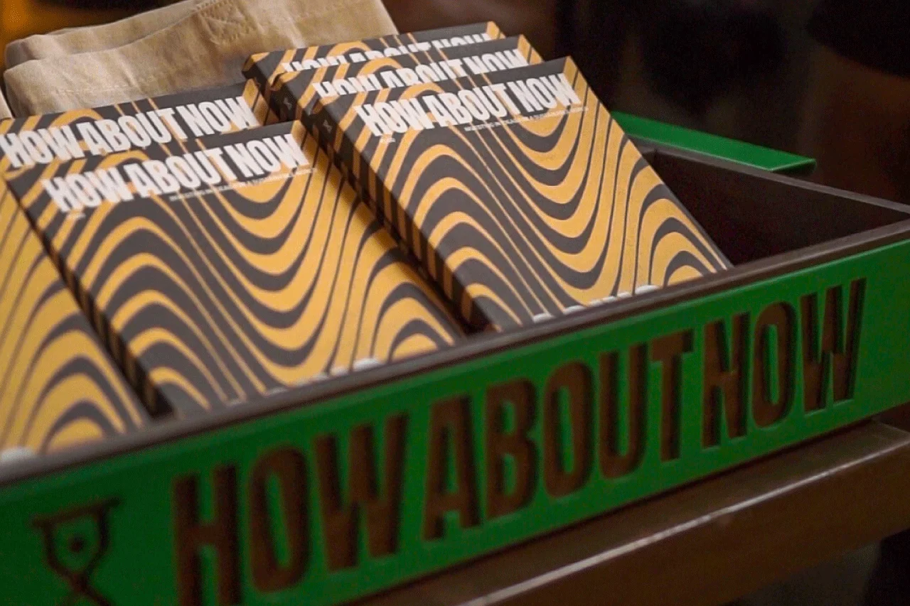
For a brand hitting refresh on its content and communications, we were tasked with expanding the visual identity of the brand, while retaining its logo form. The Paper Planes Agency worked to research and redefine WorthWhile’s visual identity via a cohesive colour palette, typography and iconography. The new identity was designed to effectively communicate the organisation’s identity as a resource platform, a network between industry experts and retail investors, and a champion of sustainable development.
