We use our own and third-party cookies to improve our services and ensure you get the best experience. By browsing the site, you are agreeing to this. You can find more information in our Privacy Policy.
c
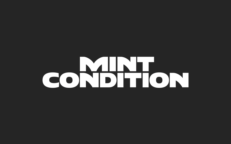
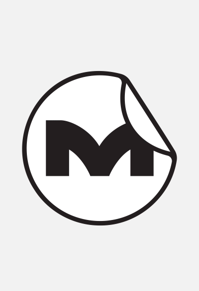
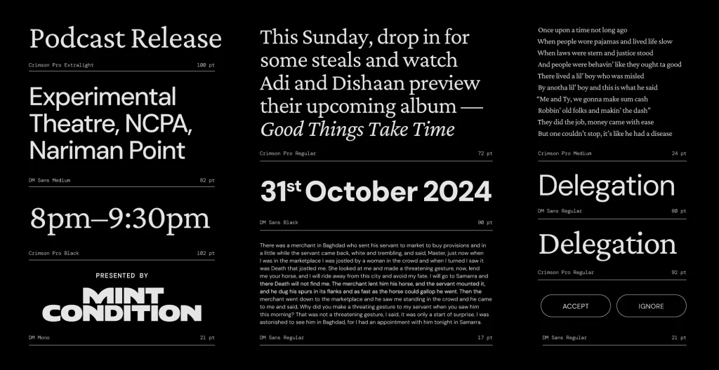
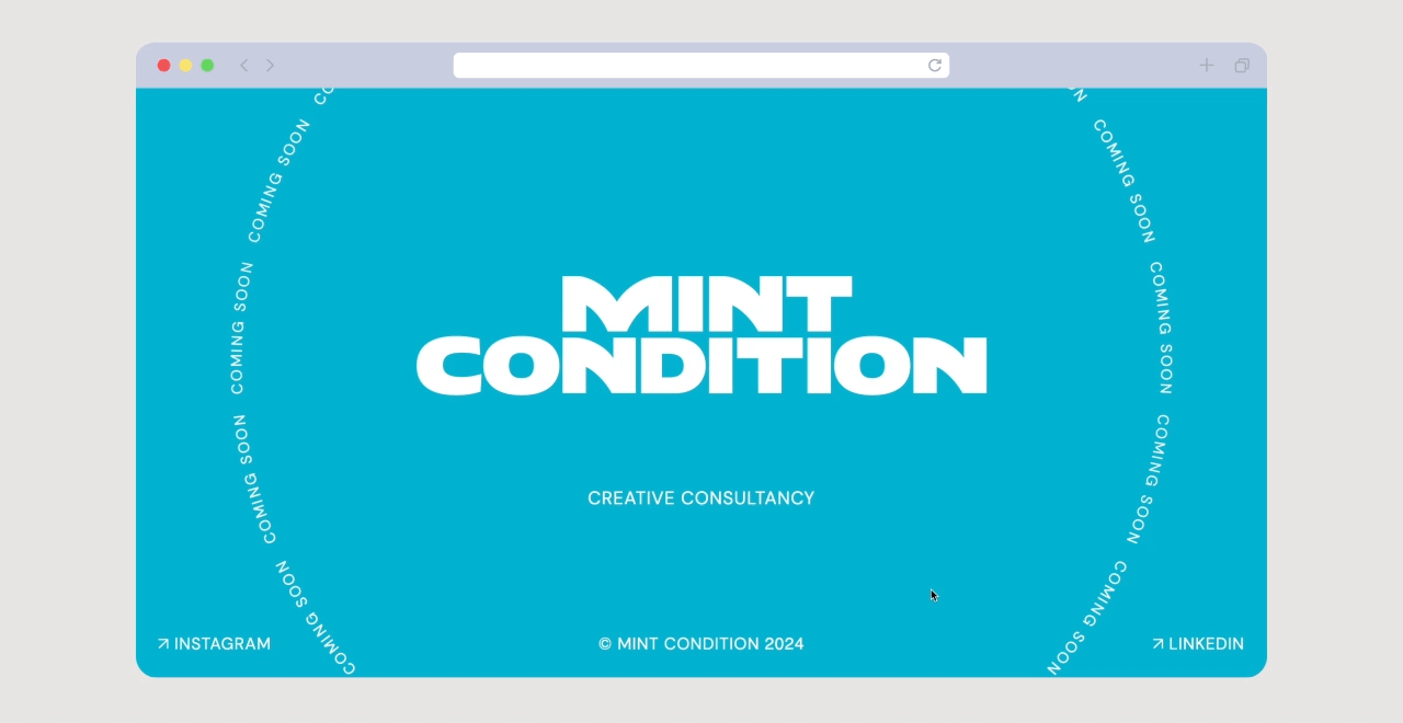
Branding for Mint Condition
Sticky design to make a mark
Mint Condition is an artist management agency that seeks to enable and equip the artists they work with in varied ways. From the outset, the founder — who comes with years of experience in this space — had a clear idea of how this new brand would position itself and how it would set itself apart from others in their industry. As a space that nurtures artists, taking care of everything from live tours and partnerships to 360º management and content production, Mint Condition would be a true confidant — reliable, encouraging, transparent, cool, ambitious and credible. The Paper Planes Agency brought that essence to live via their brand identity and their ‘coming soon’ webpage.